Fully editable and customizable digital planner
How cool it would be if we could add new links and tabs in our note-taking apps, huh? I hope this function will be available soon, but meanwhile, let’s explore other options to customize planners and journals with the links we want.
UPDATE: I recently released The most customizable digital planner I have ever made. You can change colors, text, layouts and pretty much everything in this planner using Keynote. Check it out.
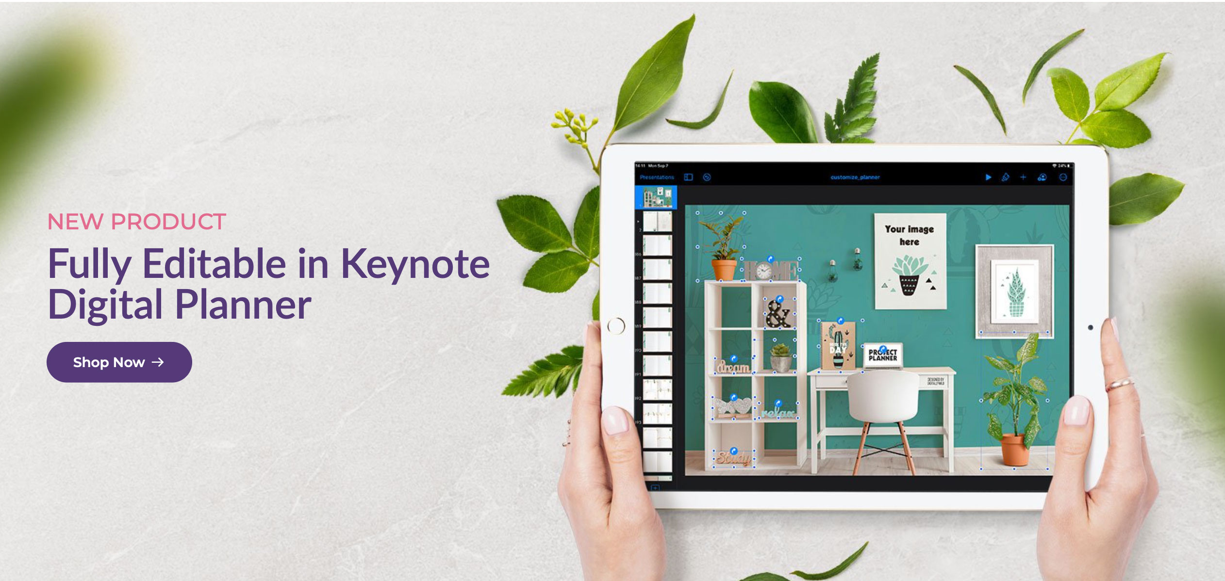
I’m happy to present to you Editable Keynote template, which gives you full freedom in terms of personalization and really making it your own. You can work in Keynote on your Macbook or Ipad. It includes yearly/ monthly/ weekly planner templates (with ability to add and link daily pages), 4 notebooks and 4 storage layouts to spice it up. :)
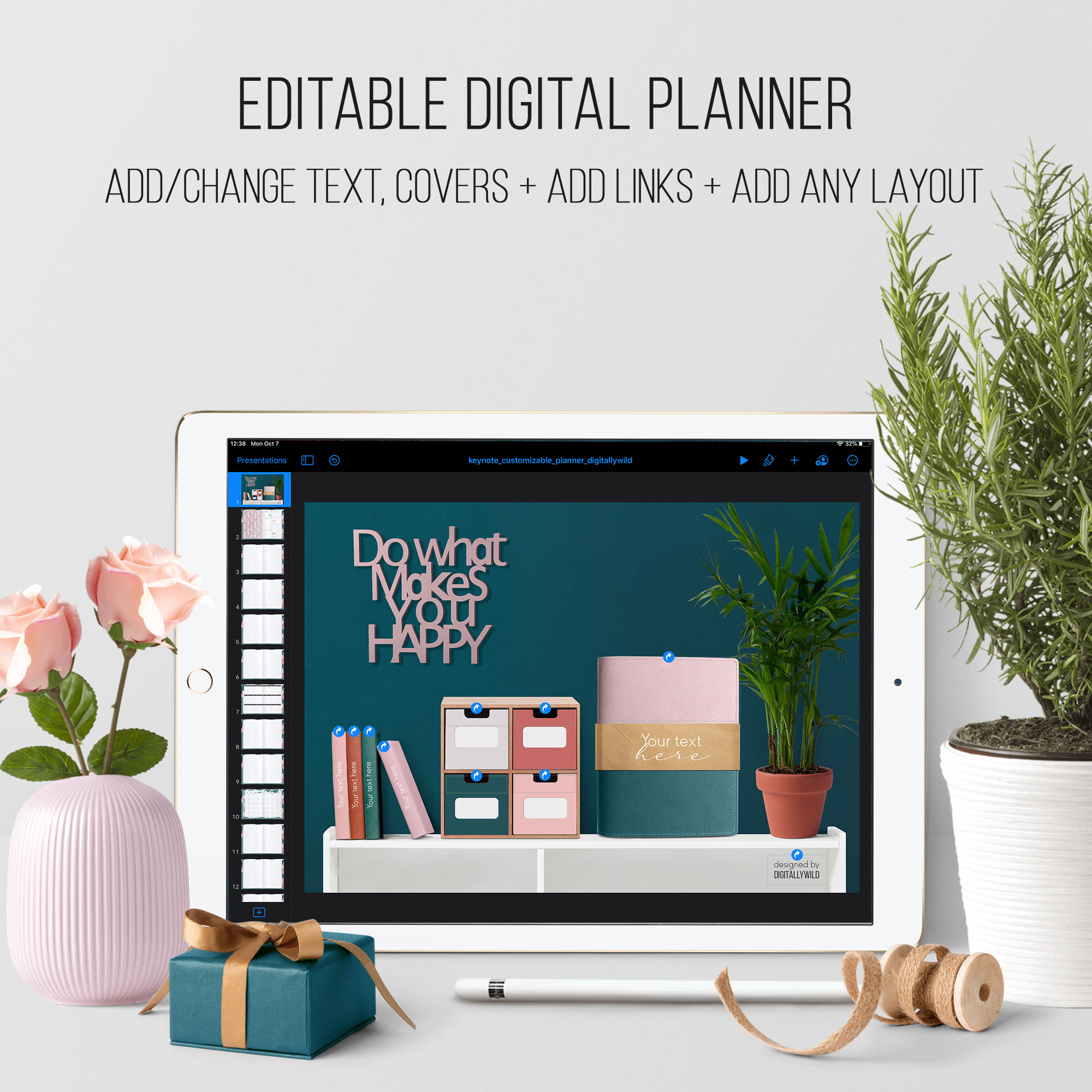
No need to be overwhelmed with the amount of work it takes to make digital planner from scratch. Enjoy only the fun part of customizing and decorating the planner as you want it. I did most of the work for you, so you could just sit back with a cuppa of tea or coffee and have fun personalizing planner and notebooks.
You can have ALL your files and plans in one place. With 4 notebooks that have 6 and 12 subject tabs, there are so many options of what info you can keep there. Be those your class notes, work files, book annotations, recipes, I mean anything you want actually. And, in the style of DigitallyWild, I’ve made a realistic stylish dashboard to which you can navigate from any page you are on and from where you have access to all your files.
So let’s take a closer look at what you can do with this template.
The download file includes:
- Keynote file with 68 slides that are already linked
- pdf planner (import directly to the note-taking app) to get the feel of what the planner can do and what you can modify
- 7 png planner covers
- png layout with links for the first spread
- 7 matching cover backgrounds
- 2 fonts that I use in this kit
- 6 monthly layouts (Monday/ Sunday start)
- 4 weekly layouts (Monday/ Sunday start)
- 3 paper templates for notebooks (dotted, lined and graphed)
- pdf instruction with steps on how to customize your planner on Ipad
The main dashboard look like this:
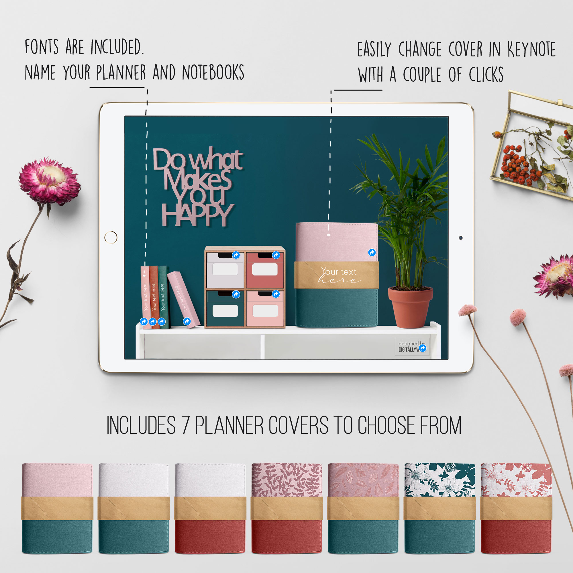
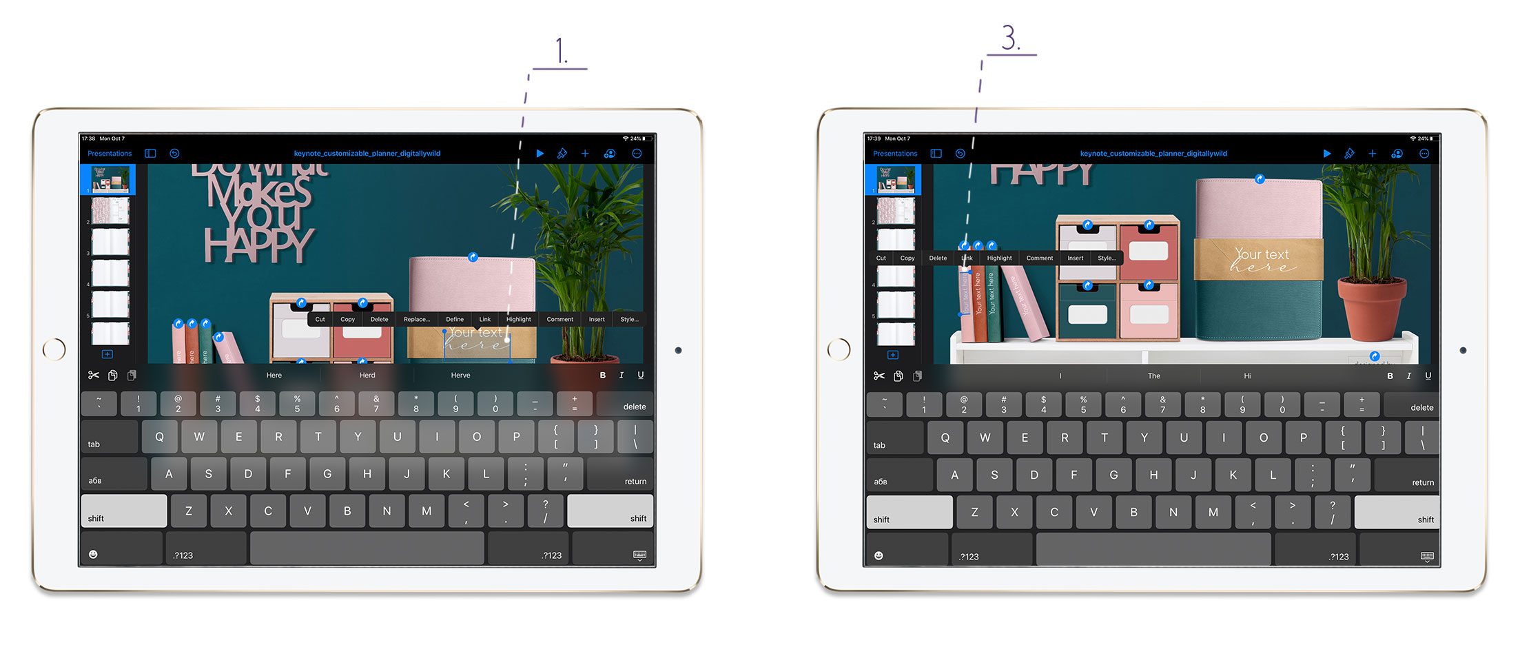
Here you can change planner cover, add titles for the cover and notebooks and name storage drawers.
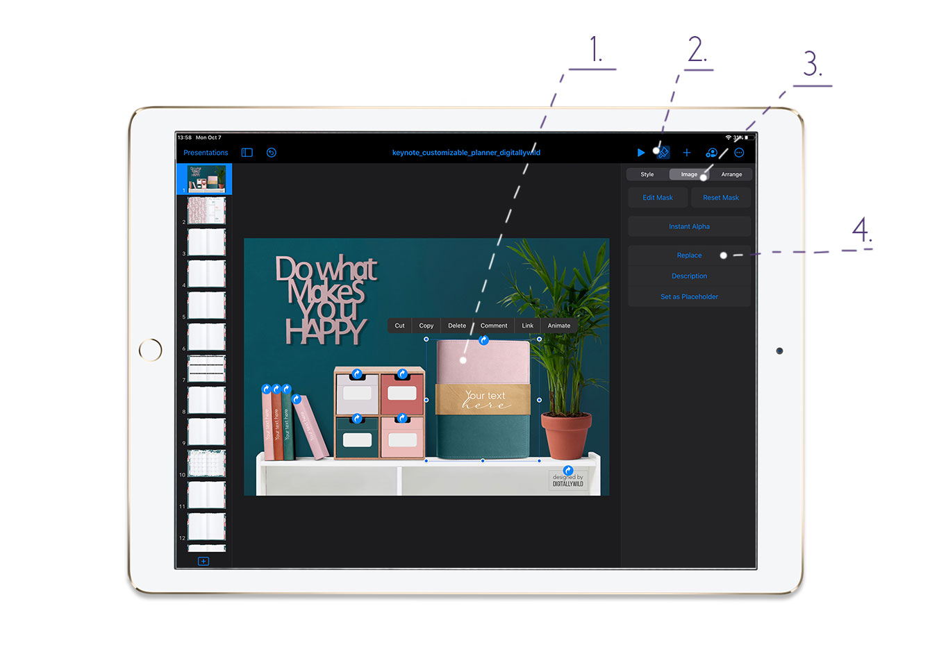
To replace planner cover:
- Tap on the cover
- Tap the Brush icon
- Choose Image - Replace and select the cover you want
To change covers text:
- Tap on the text
- Select it and type your own
- Repeat for the notebook text as well
The first planner spread look like this:
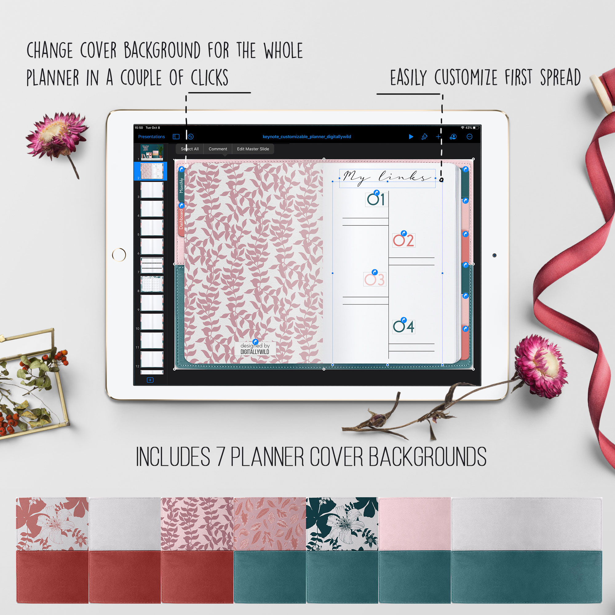
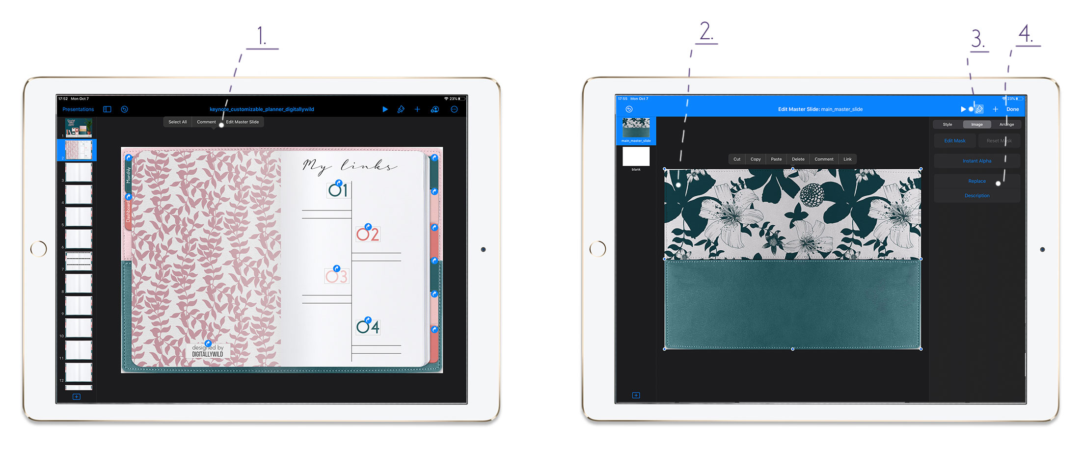
If you changed the planner cover at the dashboard, you can easily change the cover background for the whole planner.
To change planner background cover:
- Tap anywhere on the empty slide space and choose Edit master Slide
- Tap on the image - then Brush icon - Image - Replace
- Select background cover that matches your dashboard cover. Press Done. It’ll change for the whole planner
You can also edit text on the first spread and remove 4 additional links it has. You can replace the graphics for the links with your own, add photos or any layout you want.
From each planner page you can navigate to the dashboard and to monthly pages.
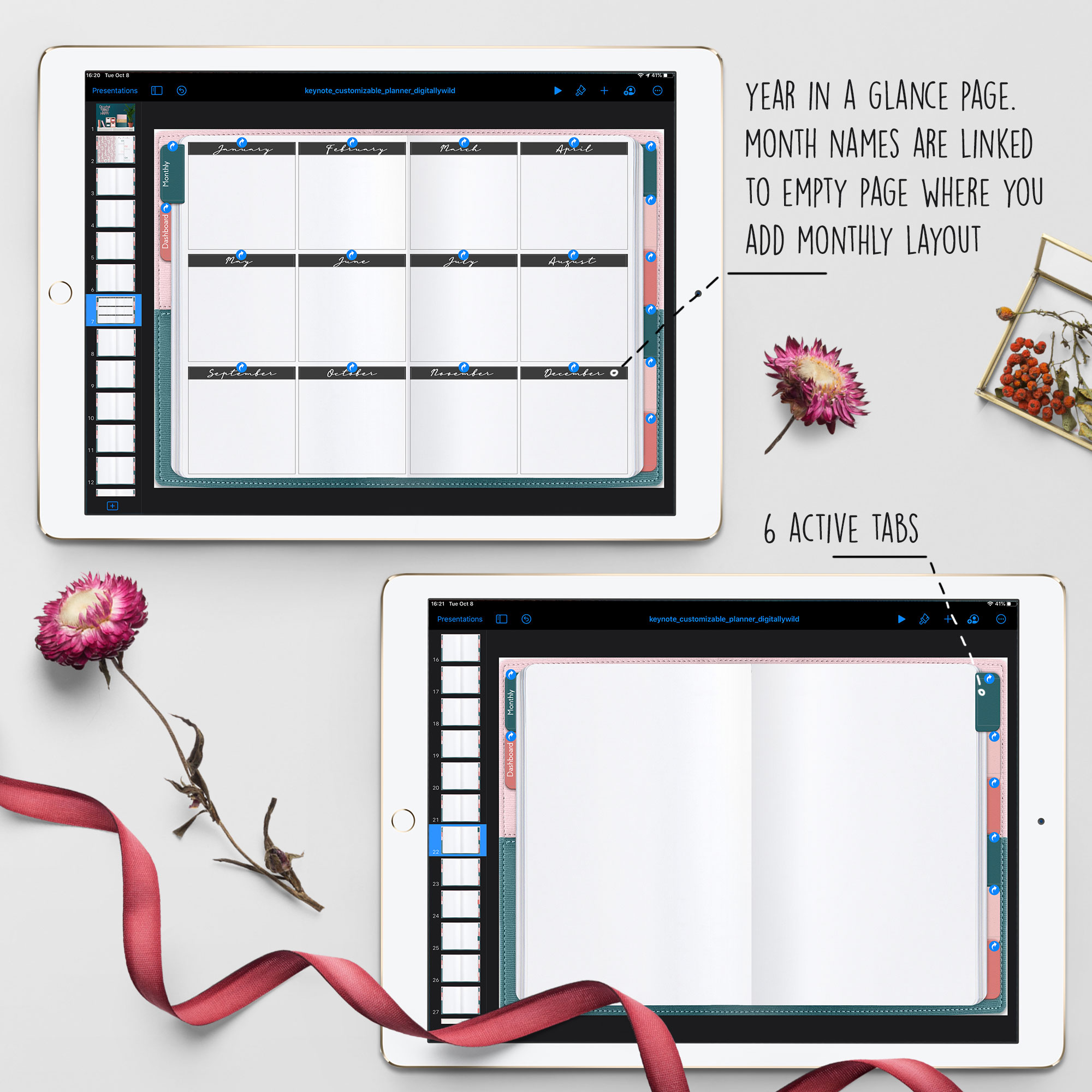
Year in a glance page can be used in so many ways: to insert dated monthly calendar, to write down important dates, track your income etc. The names of the months are linked to empty pages where you add monthly layout of your choice.
6 monthly layouts are included with this download:
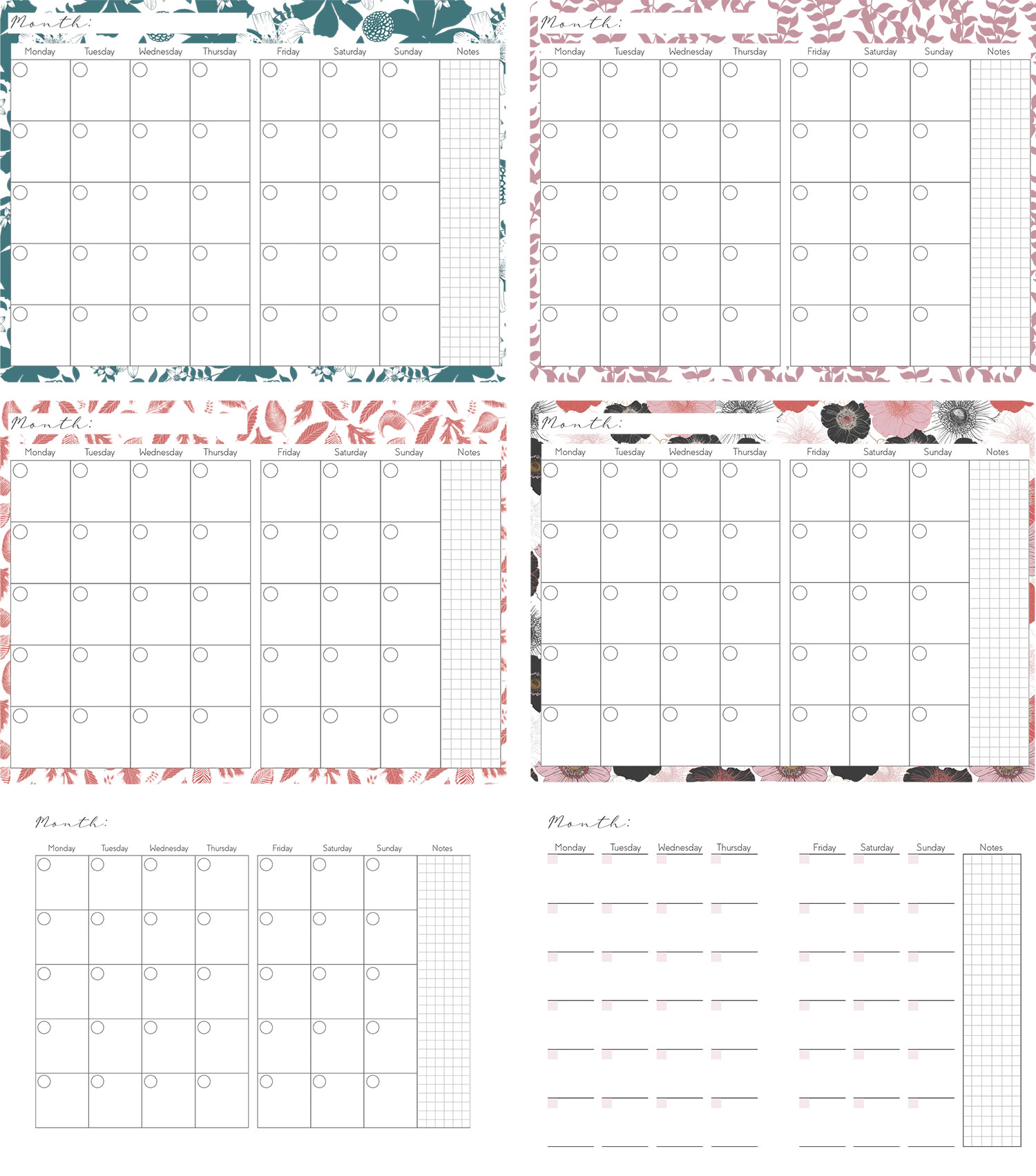
Also these layouts come with Sunday start as well. They are transparent png files, so when you add them, your spread will look like this:
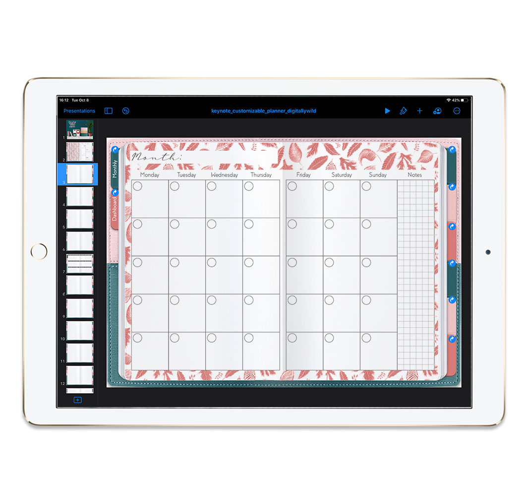
When you add the monthly layout, you can choose to link the first days of the week to weekly page or link each day to daily page. You can also make it dated.
P.S. In Monthly subscription I include dated monthly layouts and weekly layouts that you can also add to your planner.

To add slide for a weekly page:
- Tap on the slide on the left
- Choose Copy
- Then tap again and choose Paste
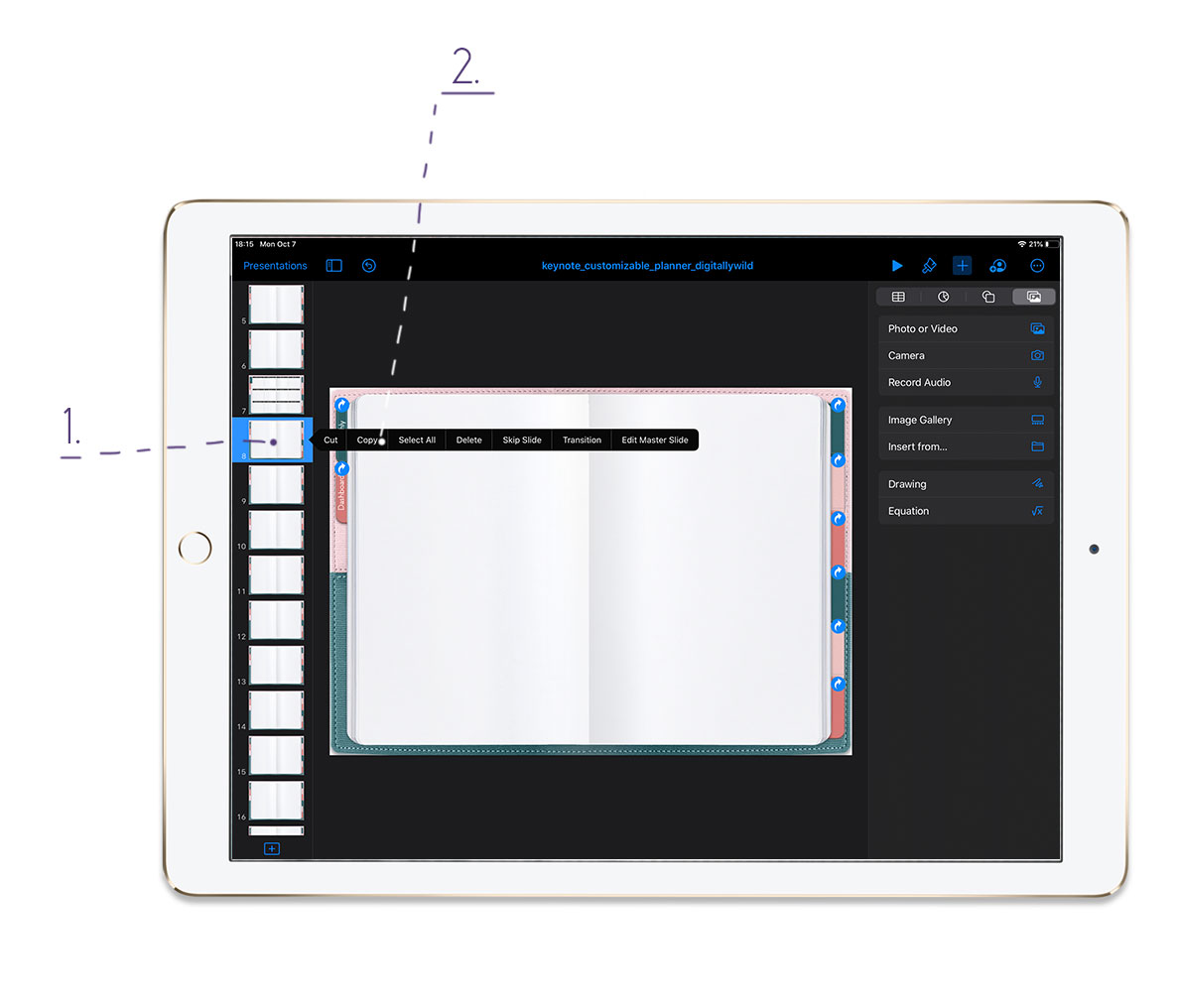
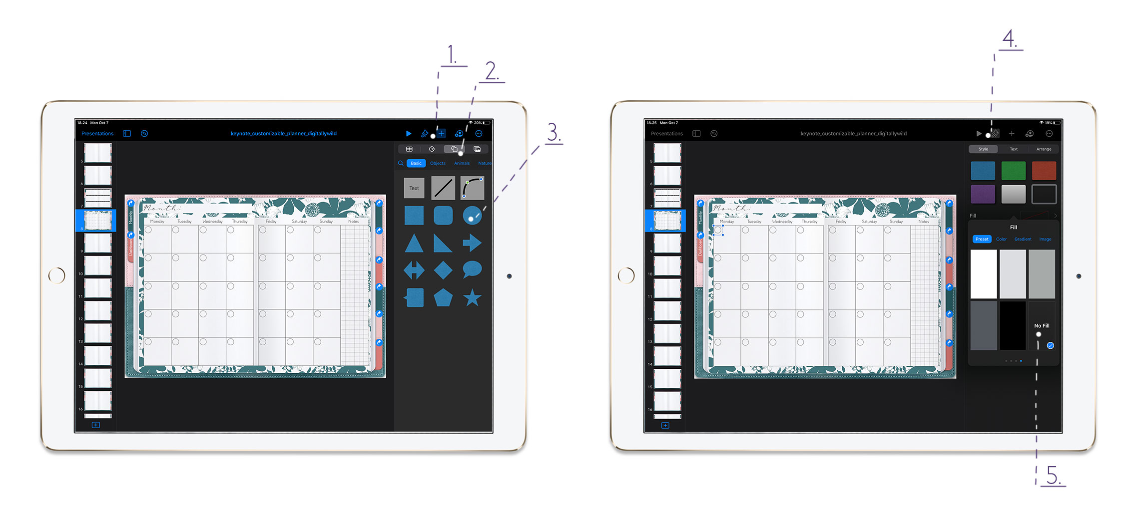
To add link for weekly or daily page:
- Tap on Plus sign
- Then Shapes - Basic and choose circle or square
- Tap on Brush icon - Fill - Choose No Fill
- Tap on the added shape - Link - Link to Slide...
From there you can choose to leave weekly pages blank or add one of the 4 weekly layouts that are included:
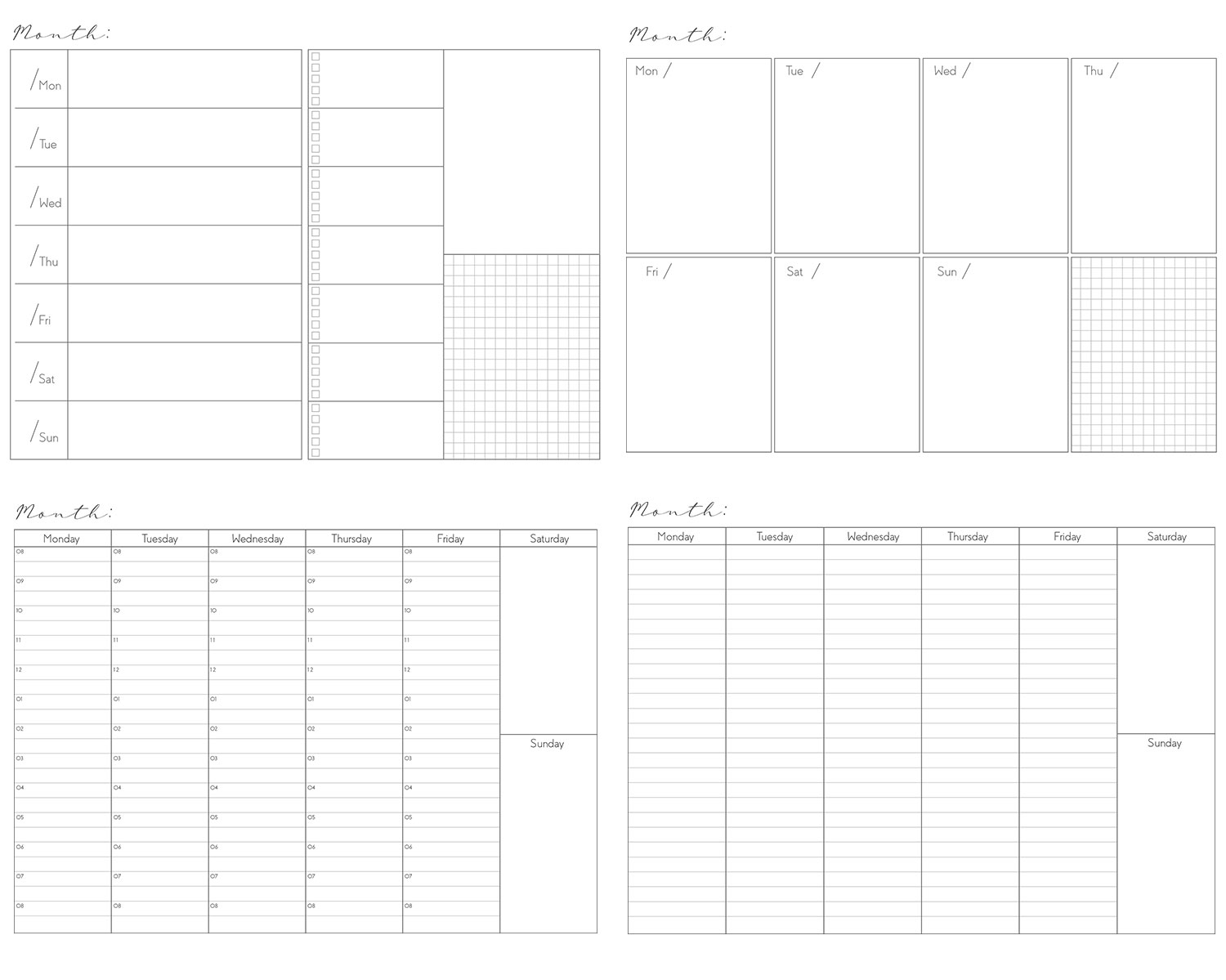
The layouts also transparent png files. Here is the example of how they will look:
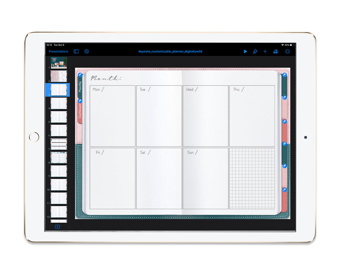
If you are not afraid of a challenge, you can link each day of the week to daily page. :)
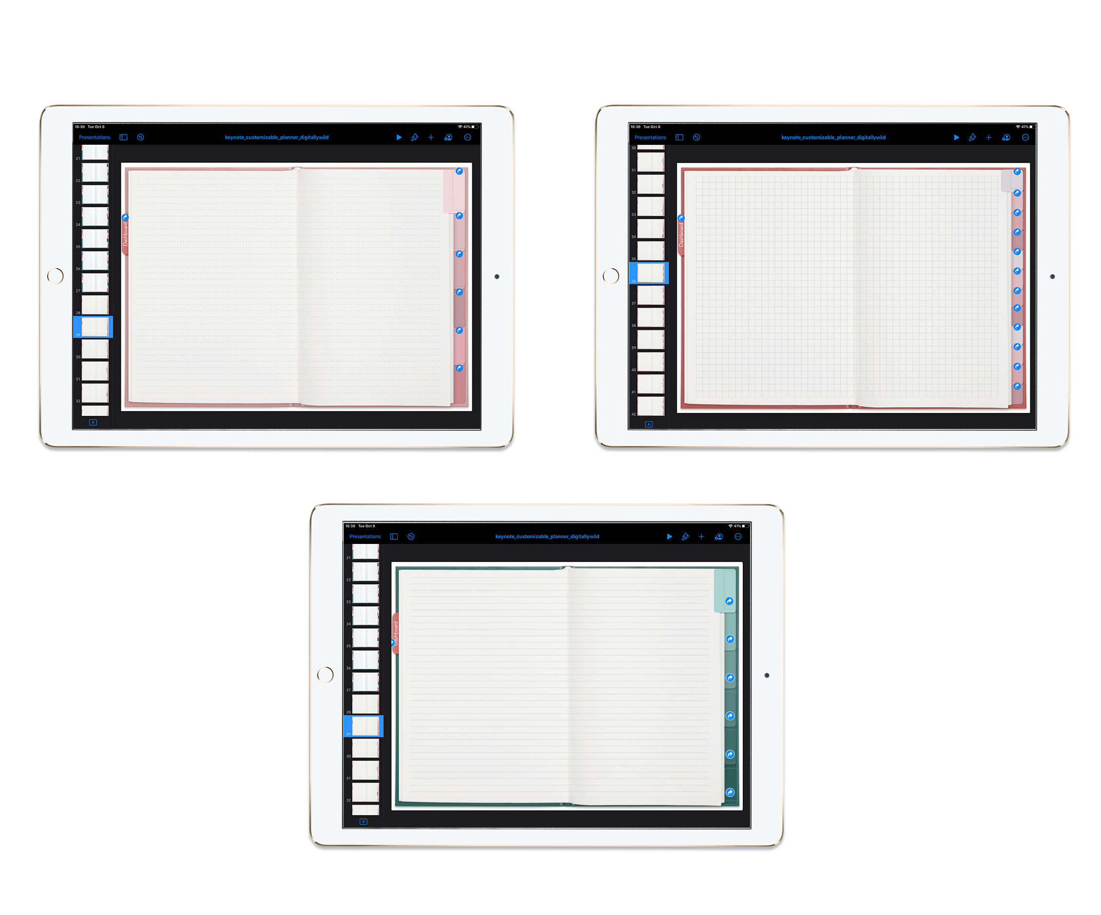
This planner kit includes 4 notebooks with subject tabs.
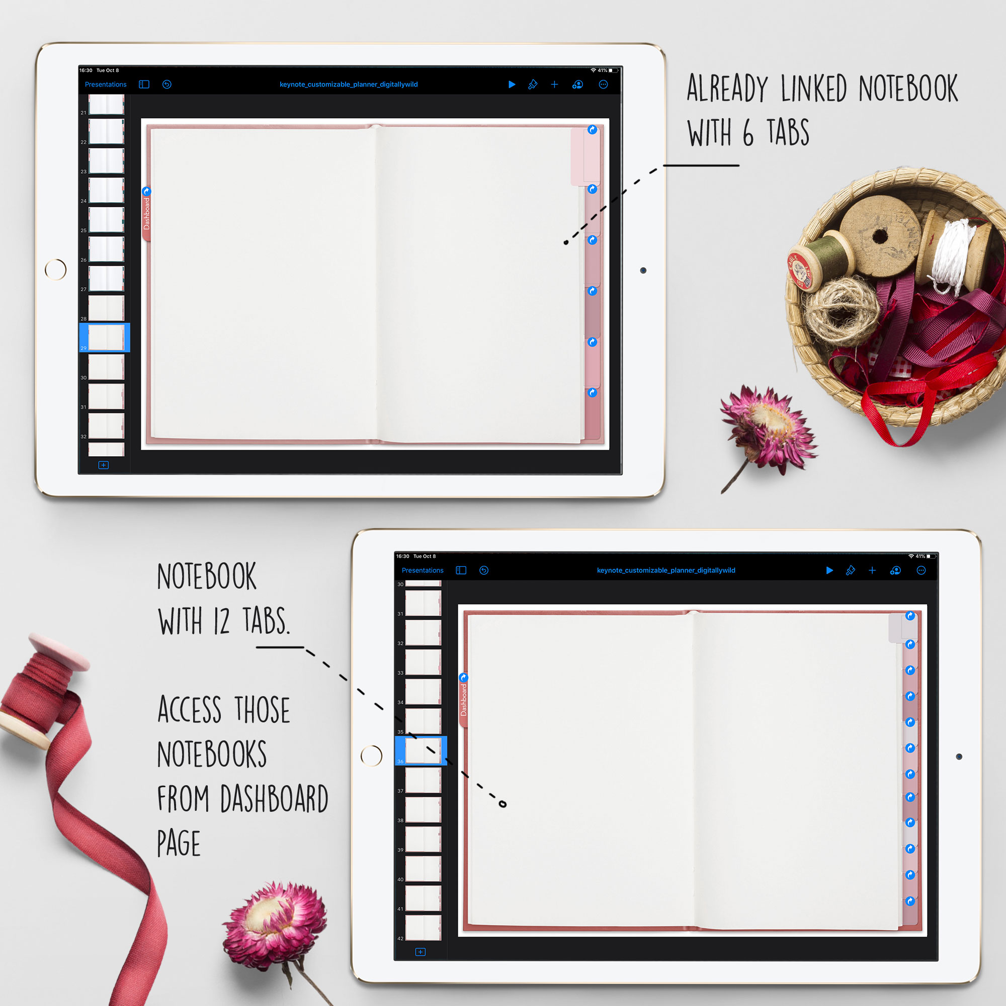
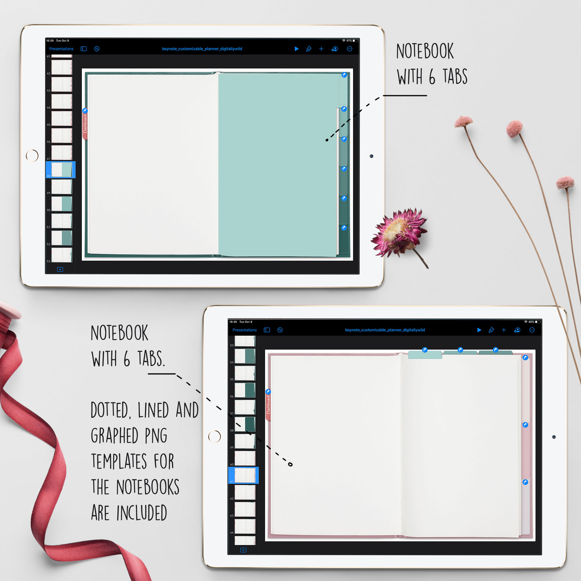
To add tab names:
- Tap on Plus sign - Shapes - Basic - Text
- Write down the name for the tab. To change Font: Tap on Brush icon - Font
- Rotate the text by placing two fingers on it and rotate
- Copy/ paste the text on the tabs. To select multiple text tabs - Hold one and tap other ones. Choose Copy - go to next slide and Paste. Tabs text will be placed in the same spot

I include 3 paper templates for those notebooks: dotted, lined and graphed. They are transparent png files, so can be easily added to any page. After you placed paper template, select it, tap Copy and go to the next slide. Tap Paste to add the same template to the next page. It’ll be copied in the same spot.
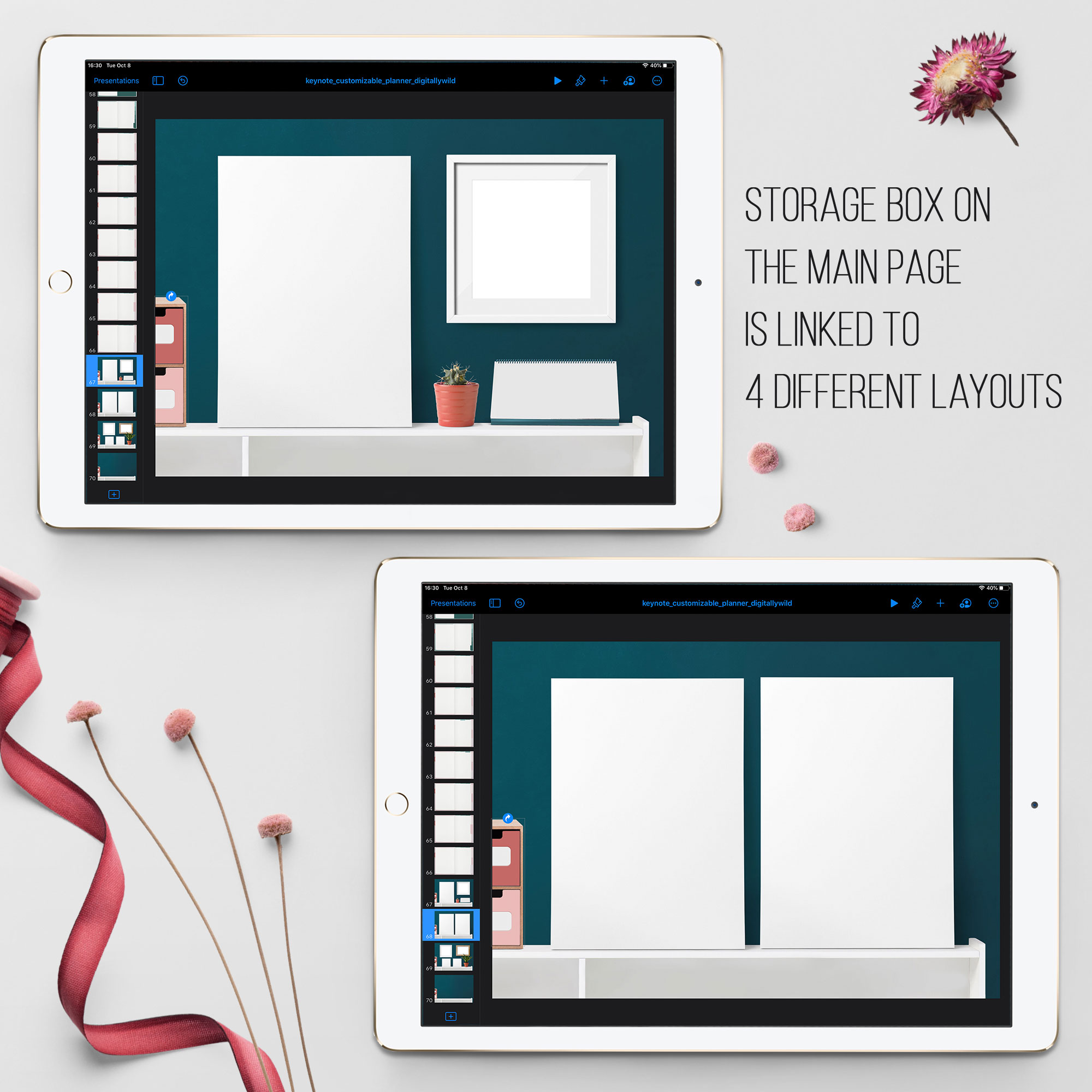
And, last but not least, the storage space design in the style of DigitallyWild. :)
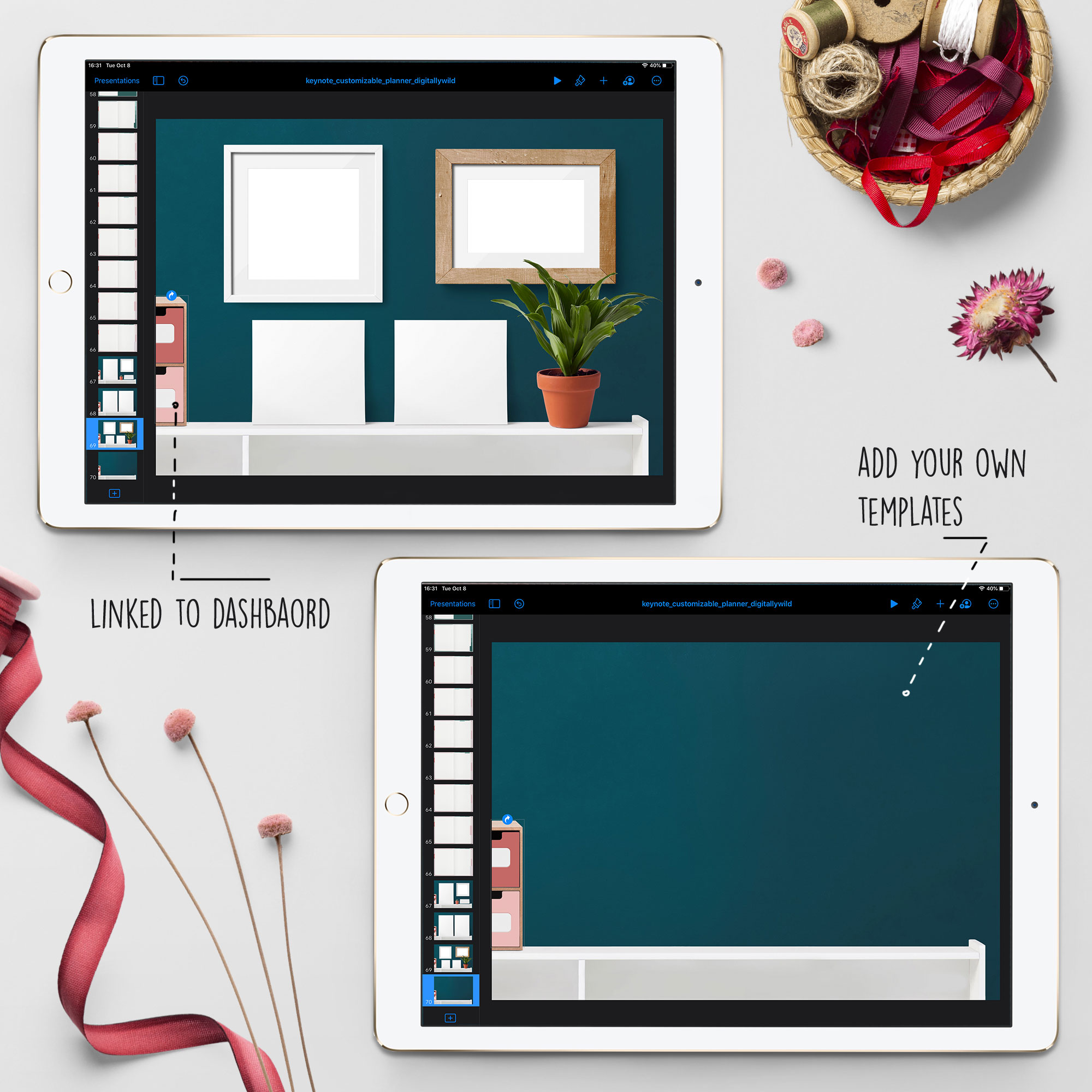
You’ve probably noticed the storage box at the dashboard. The 4 drawers are linked to different layouts. You can also choose to link elements in those layouts to your own pages or templates.
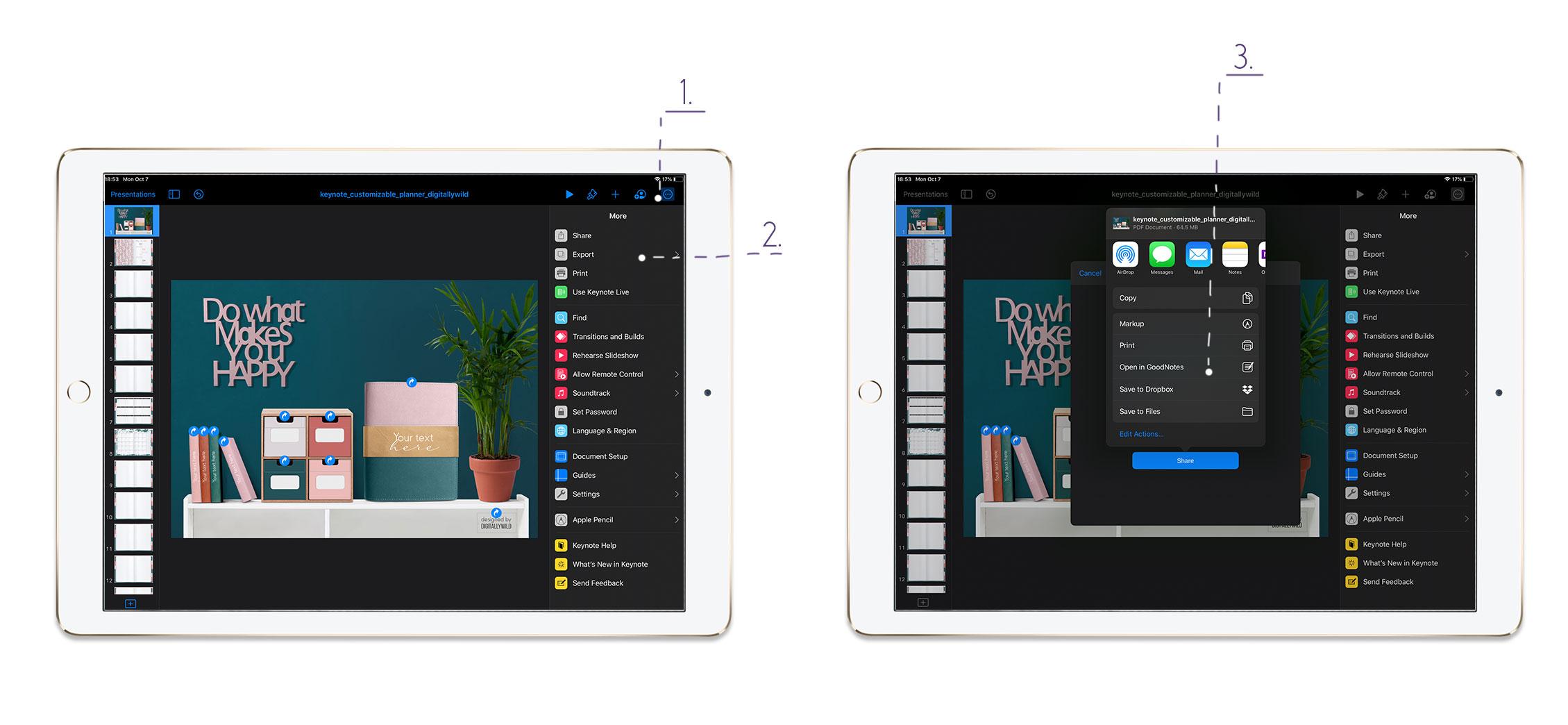
To export planner:
- When you finished your customization, tap on three dots at the top right
- Choose Export - PDF
- Open in Goodnotes, save to Files or Dropbox
I’m sure you’ll have so much fun playing with this planner kit. There is certainly some learning curve with Keynote app, but when you did it once, you’ll get the hand of it.
I’m always happy to help and answer your questions. Leave a reply in comments or drop me a line to katesnitser@gmail.com
Talk to you soon,
Kate